BLAST Visualization
Perhaps because of my roots in systems biology (or the cause of going there in the first place), I have always had an interest in creating visually appealing images of data, many times in the form of networks. I find that often in bioinformatics, one of the hardest problems is to make information understandable. For example, a BLAST output might say very little about how the genes or proteins are connected to each other, at least to the untrained eye.
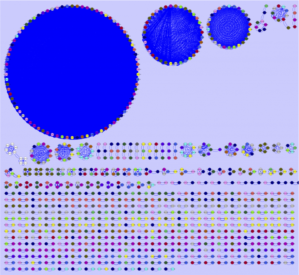
Therefore, during the last weeks I have fiddled around with various ways of viewing interesting portions of BLAST reports. By making all-against-all BLAST searches, and outputting the data in table format (blastall option -m 8), I have been able to extract the hits I am interested in and export them into a Cytoscape compatible format, with some accompanying metadata (scores, e-values, alignment length, etc.). The results are many times pretty unparsable by the eye, rendering them a bit meaningless, but have been more and more interesting as I have put more effort into the extraction script. Just as an example, I here provide a simple map of the best all-against-all matches in the Saccharomyces cerevisiae genome, as a Cytoscape network (click for full size):
The largest circle consists of transposable elements (jumping DNA which inserts itself at multiple locations in the genome, no surprise there is a lot of them, and that these are pretty conserved). The circle to the left of the transposon circle consists of genes located inside the telomeric regions. Why they show such high similarity I do not know, but it seems plausible that the telomere thing could play a role here. The third circle contain mostly members of the seripauperin multigene family, which is also located close to the telomeres. At the bottom you found the gene pairs, that match to each other. You could go on with all the smaller structures as well, but I am no yeast expert, so I will stop here, letting this serve as an example of what a BLAST report really look like.
For this image, I have used a blastn report of all yeast ORFs (taken from yeastgenome.org) as input to my extraction tool, selected Cytoscape compatible output, and used a maximal e-value of 0.00001 and an alignment length of at least 50 nts as criteria to be extracted. I have also pooled the sequences according to chromosome number. The pooling was used to color code the nodes in Cytoscape. The edge width is connected to alignment score, a high score renders a thick line, and a low score causes the line to be thin.
I am still working on the extraction tool and will not provide any code yet. Input would, however, be appreciated. My personal opinion is that in the near future, the overload of newly produced DNA and protein sequences will choke us if do not come up with more intuitive ways of displaying data. I don’t think that the network above is there yet. Still, it conveys information I would not have been able to understand from just looking at the BLAST output. The first attempts to come around the sequence overload problem won’t be the best ones. But we got to start working on visualization methods today, so that we do not end up with sequences over our shoulders in just a few years. Besides, a network image seems much more impressive than a number of lines of text…
